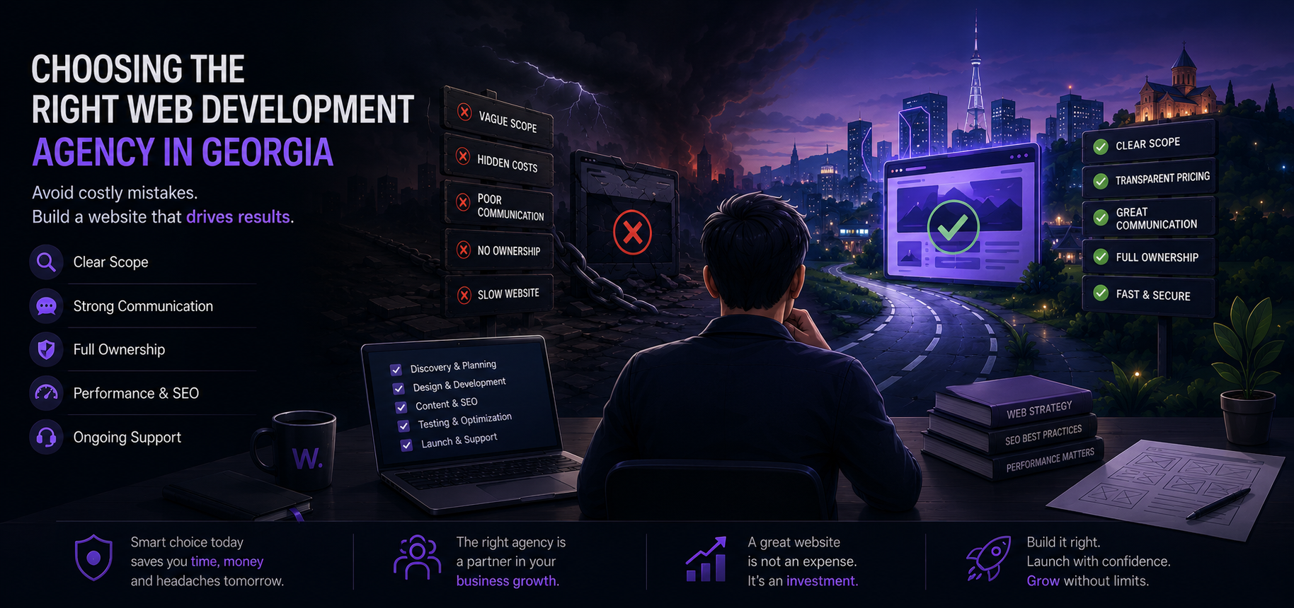
How to Build a Credible Website with AI in 2026
Use AI to plan, write, and prototype a small business website that still feels real. Pick the right build path and cover trust, security, and testing.
Building a professional site in 2026 is less about learning every tool and more about making good decisions: what the website is for, what it must do, and what “good enough” looks like. AI can help you move faster, but it won’t replace strategy, taste, or quality control. This guide walks through how to build a website with AI in a way that still feels credible, specific, and secure.
What AI can and can’t realistically do when building a website
AI is useful when the work is repetitive, draftable, or pattern-based. It struggles when the work needs business judgment, real-world verification, or a strong point of view.
What AI is good at
- Turning rough inputs into a plan. If you can describe your business and goals, AI can propose pages, sections, and user flows.
- Drafting copy and variations. Headlines, value propositions, FAQs, service descriptions, and multiple tone options.
- Speeding up design exploration. Moodboards, layout ideas, component suggestions, color pairing options.
- Generating code scaffolding. Page templates, UI components, form validation, simple scripts, documentation.
- Debugging and explaining. “Why is this button not clickable?” “What does this error mean?” “How do I improve Lighthouse issues?”
- Content ops. Turning a long service description into 5-page copy, converting notes into structured content, creating alt text drafts (still needs review).
What AI is not good at (and won’t be in your favor if you ignore it)
- Knowing what’s true about your business. It will confidently invent details unless you give it precise inputs and enforce boundaries.
- Making final design choices. It can produce something acceptable, but “acceptable” often looks generic.
- Security and compliance by default. AI can write insecure code and miss basics like rate limiting, spam protection, secure cookie settings, and dependency risks.
- Owning outcomes. You still need to test, measure, and decide. AI can’t tell you if your pricing page is convincing or if your booking flow is frustrating.
- Understanding your market. It can summarize typical competitors, but it can’t replace actual research and conversations with customers.
A practical way to use AI: let it generate drafts, then you choose, edit, verify, and test.

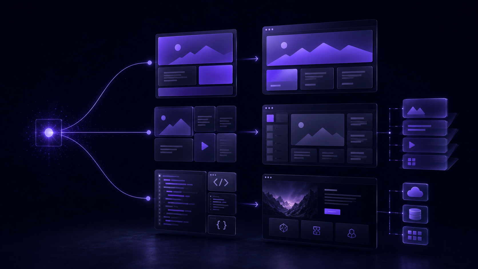
Three ways to build: AI website builder vs CMS + AI vs custom code + AI
In 2026 you typically land in one of these paths. Your choice affects cost, flexibility, speed, and how much you’ll depend on a platform.
| Approach | Best for | Strengths | Trade-offs to accept | Typical “gotchas” |
|---|---|---|---|---|
| AI website builder (hosted) | Very small sites, fast launch | Fast setup, hosting included, templates, built-in basics | Less control, platform lock-in, harder to do custom flows | Generic design, limited integrations, SEO control varies |
| CMS + AI (WordPress or similar) | Most small business sites | Content editing, plugins, flexible pages, can scale | More setup, plugin quality varies, maintenance matters | Plugin bloat, slow pages, security updates ignored |
| Custom site + AI code editor | Unique UX, performance, custom features | Full control, best performance potential, tailored UI | Needs real dev skill, more decisions, testing burden | Incomplete edge cases, security mistakes, higher initial effort |
How to choose quickly
- If you need “live by Friday” and it’s mostly brochure content: AI builder can work.
- If you’ll publish content over time and need flexibility: CMS + AI is usually the sweet spot.
- If you need booking logic, portals, custom quoting, or complex integrations: custom build (with AI-assisted development) is safer long-term.
A common pattern: start with CMS + AI for speed, then move custom features into a bespoke build once you’ve validated what customers actually use.
Define the website before you touch tools
Most AI-built sites fail for one boring reason: the owner never defined what the site must accomplish. Start with decisions that are hard to “prompt” your way out of.
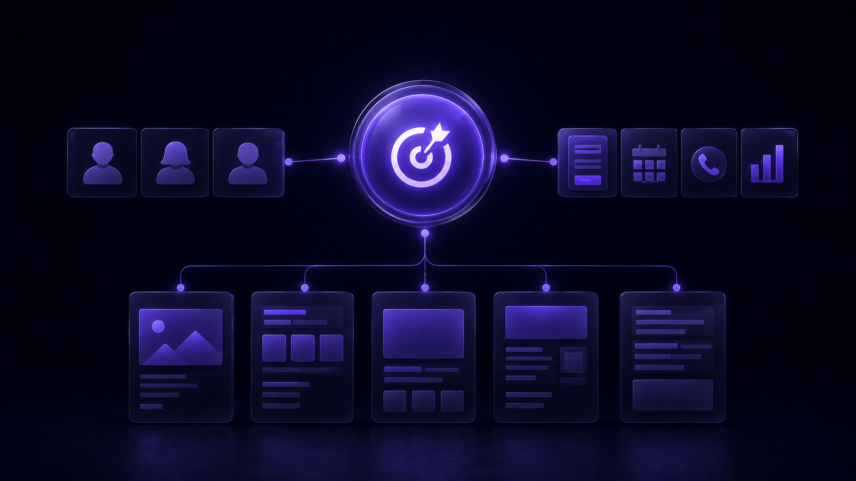
1) Decide the purpose (one primary action)
Pick one primary action per visitor type. Examples:
- Restaurant: book a table
- Clinic: request an appointment
- Construction company: request a quote
- B2B service: book a call
- Retail: purchase a product
If you try to optimize for five actions, you’ll do none well.
2) Define your audience in plain language
Write 2–3 audience bullets like a real person:
- “English-speaking expats in Tbilisi who want a predictable price.”
- “Busy parents who need weekend appointments.”
- “Small companies that need invoices and reporting.”
Then list 3 objections you must address on the site:
- “Is this legit?”
- “How much does it cost?”
- “How long does it take?”
- “What’s included / excluded?”
3) Decide the pages (start small)
A professional small business site often starts with 5 pages:
- Home
- Services (or Products)
- About
- Portfolio/Case Studies (or Gallery)
- Contact
Add only what you can maintain. A “Blog” with one post from 2023 hurts trust.
4) List required features (avoid vague)
Turn “we need a modern website” into checkboxes:
- Contact form (with spam protection)
- WhatsApp / phone click-to-call
- Map embed
- Booking (request vs instant confirmation)
- Payments (deposit vs full payment)
- Email marketing signup
- Multi-language (how many pages translated?)
- Analytics (basic events you want to track)
Prompt 1: Planning a website
You are helping me plan a small business website. Ask me up to 12 questions, one by one, to clarify:
1) the primary goal of the website,
2) the target audience and their objections,
3) the services/products and pricing model,
4) trust signals we can prove,
5) required features (forms, booking, payments, integrations),
6) languages needed,
7) what content assets I already have (photos, testimonials, logos),
8) what “success” means in 30 days after launch.

After the questions, produce:
- a one-sentence website goal,
- a prioritized page list (max 7 pages),
- key messages for each page,
- a simple tracking plan (events to measure).
My business: [describe in 4–6 sentences]
My location/market: [city/country]
Let AI draft your sitemap and content plan
Once your purpose and pages are clear, AI becomes genuinely helpful: it can propose structure, navigation labels, and the content blocks each page needs.
What a good sitemap output looks like
You’re aiming for:
- Navigation labels that match user intent (“Prices” beats “Solutions”).
- A shallow structure (important pages reachable in 1–2 clicks).
- Page sections that answer objections (process, guarantees, FAQs, examples).
Use AI, but constrain it
Give AI your real constraints:
- “We only have 6 photos.”
- “We can’t claim 24/7 support.”
- “We don’t publish pricing.”
- “We operate in Georgian and English.”
Prompt 2: Creating a sitemap
Create a sitemap for a professional [industry] website with 5–7 pages.
Constraints:
- Primary conversion: [book a call / request a quote / buy / booking request]
- Target audience: [who]
- Tone: [direct, friendly, premium, etc.]
- Languages: [English + Georgian] (if relevant)
For each page, list:
- purpose of the page,
- H1 suggestion,
- 6–10 section blocks in recommended order,
- 3 internal links to other pages,
- 5 FAQ questions specific to this business.

Business details (facts only):
- Services/products: [...]
- Location/service area: [...]
- Proof/trust signals we can use: [...]
- Things we must NOT claim: [...]
Create a visual direction that doesn’t look “AI-made”
AI can generate “a design,” but a generic design is easy to spot: stock gradients, random blobs, trendy fonts, and layouts that don’t match your industry. The goal is not to let AI “design your site.” The goal is to use AI to explore directions faster, then make a few strong choices.
Start with real inputs, not vibes
Collect:
- 5–10 competitor sites (note what feels trustworthy vs cheap)
- 3–5 sites you personally like (not necessarily your industry)
- Your real assets: logo, colors (if any), photos, location shots, team photos, product photos
Then decide:
- Typography: 1 font family or 2 max (heading + body)
- Color system: 1 primary, 1 accent, neutrals
- Imagery style: real photography vs illustrations, warm vs clinical, close-ups vs wide shots
- UI density: spacious vs compact (depends on audience age and device usage)
The “anti-generic” trick: pick constraints
Examples of useful constraints:
- “No gradients. White background. One accent color.”
- “Use our real workshop photos as the main visual, no AI images.”
- “Cards and borders, no shadows.”
- “Prefer simple icons, no 3D.”
Prompt 4: Developing a visual direction
Act as a web designer. Based on the business details below, propose 3 distinct visual directions for a website.
For each direction, include:
- name (2–4 words),
- color palette (5 colors with hex suggestions),
- typography suggestions (Google Fonts ok),
- layout notes (grid, spacing, section rhythm),
- button and form styling notes,
- photo/illustration guidance (what to use, what to avoid),
- 5 do’s and 5 don’ts to prevent a generic “AI-looking” result.

Business: [facts about what you sell, who you serve, price level]
Brand traits: [e.g., practical, calm, high-trust, local]
Must use: [logo/colors/assets]
Must avoid: [things you hate]
Write website copy with AI (and keep it true)
AI copy becomes “fluffy” when it lacks facts. Your job is to feed it specifics and force it to stay within them.
What to give AI before it writes
Provide a fact sheet:
- What you do (in one sentence)
- Who you do it for
- Service area and hours
- Pricing model (even if you don’t publish it)
- Timeline expectations
- What’s included / excluded
- Guarantees you can honestly offer
- Proof: years, certifications, client types, case examples (only what’s real)
Then ask for copy with constraints:
- “No claims about being #1.”
- “No generic adjectives.”
- “Use short sentences.”
- “Use local details where relevant.”
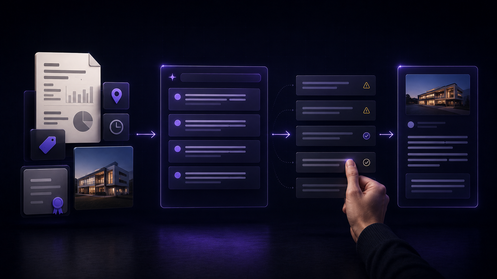
A simple accuracy workflow
- Generate draft copy.
- Highlight every claim (experience, outcomes, “fast,” “secure,” “best”).
- Replace claims with verifiable facts or remove them.
- Make the CTA match your real process (“Request a quote” vs “Buy now”).
Prompt 3: Writing homepage copy
Write homepage copy for my business website.

Rules:
- Use only the facts I provide. If something is missing, write [NEED INFO] instead of guessing.
- Short sentences. No hype. No “best in class”.
- Write for a visitor who is comparing 2–3 options and is skeptical.

Output structure:
1) Hero: H1 + 2-line subheading + primary CTA text + secondary CTA text
2) 3 benefit bullets (specific, not generic)
3) Services summary (3–6 items, each 1–2 sentences)
4) “How it works” (3–5 steps)
5) Trust section (proof we can show)
6) FAQ (6 questions)
7) Closing CTA section (headline + 2 sentences)

Facts:
- Business name: [...]
- What we do: [...]
- Location/service area: [...]
- Typical customer: [...]
- Pricing model: [...]
- Timeline: [...]
- Proof/testimonials: [...]
- What we do NOT do: [...]
Tone: [...]
Use AI to speed up development (code, forms, integrations)
This is where AI saves time, but it’s also where mistakes get expensive. Treat AI like a junior developer: fast, helpful, and in need of review.
Components and pages
AI can generate:
- Responsive navigation (desktop + mobile menu)
- Pricing tables, FAQ accordions, testimonials sliders
- Reusable sections (“feature list,” “process steps,” “case study card”)
- Basic animations (but keep them subtle)
Trade-off: The first version often looks fine but fails on edge cases: long menu labels, very small screens, keyboard navigation.
Forms (contact, quote requests, lead capture)
Ask AI for:
- Form field suggestions based on your service (not too many)
- Validation (email format, required fields)
- Error and success states
- Spam prevention options (honeypot, rate limiting, CAPTCHA where appropriate)
Non-negotiables:
- Don’t email form submissions in plain text to multiple addresses without thinking.
- Store as little personal data as you need.
- Make it obvious what happens after submission (“We reply within 1 business day.”)
Integrations (booking, payments, CRM, analytics)
AI can help you wire things up, but you should decide what you actually need.
Common choices:
- Booking: request-based (you confirm) vs instant-confirmation (system confirms)
- Payments: full payment vs deposit; refund policy page
- CRM: even a simple pipeline (New lead → Contacted → Quoted → Won/Lost)
- Analytics: track events that map to your goals:
contact_form_submitphone_clickwhatsapp_clickbook_now_clickcheckout_complete
Trade-off: Every integration is another failure point. If you don’t test it monthly, keep it minimal.
AI coding prompt tip: require “explain + test”
When you ask for code, always request:
- a short explanation,
- how to test it,
- and the edge cases.
Example instruction to add to your prompt:
- “Include keyboard accessibility.”
- “Explain how this handles errors.”
- “Provide 5 manual test cases.”
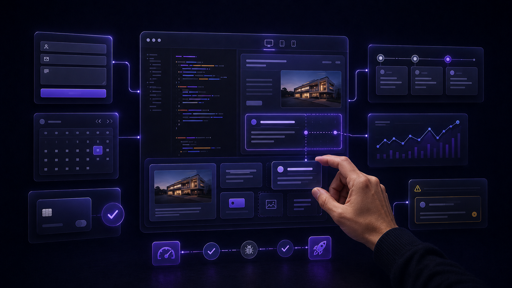
Optimize the finished website: mobile, accessibility, SEO, security, speed
A “working” site isn’t the same as a professional one. These checks are where most DIY AI sites fall apart.
Mobile: design for thumbs first
- Buttons must be easy to tap.
- Keep primary CTA visible early.
- Avoid huge hero sections that hide key info.
- Test on a real phone, not only a resized browser.
A good practical check: can someone complete your main action (call, form, booking, purchase) with one hand?
Accessibility: not perfection, but basics done
Start with:
- Proper heading order (H1 once, then H2/H3)
- Visible focus states (keyboard users)
- Sufficient contrast for text
- Alt text for meaningful images (not for decorative ones)
- Form labels (not only placeholders)
SEO: structure and intent, not tricks
Do the boring parts well:
- One clear topic per page (service page = that service)
- Unique page titles and meta descriptions
- Internal links between related pages
- Real FAQs that match customer questions
- Fast loading and mobile usability (these affect outcomes even beyond ranking)
Security: reduce risk with simple habits
- Use strong passwords and 2FA where possible
- Keep plugins/dependencies updated
- Limit admin accounts
- Avoid copying random scripts/snippets you don’t understand
- Validate and sanitize form inputs (especially if you store submissions)
Loading speed: remove what you don’t need
Biggest wins usually come from:
- Compressing images and serving the right sizes
- Limiting heavy fonts and third-party scripts
- Avoiding plugin overload
- Caching (where relevant)
Prompt 5: Reviewing a page for SEO and usability problems
Review this webpage content and structure for SEO and usability issues.

Input I will provide:
- Page URL (optional)
- Page title + meta description draft
- The on-page headings and section order
- The main copy text
- Any CTAs and form fields

Your output:
1) Top 10 issues (ranked by impact)
2) Specific fixes for each issue (rewrite suggestions where needed)
3) Missing content (based on user intent)
4) Internal link suggestions (what to link to, with anchor text)
5) Mobile usability risks
6) Accessibility risks (headings, contrast notes, forms, focus)

Rules:
- No keyword stuffing advice.
- Focus on clarity, intent match, and conversion.
Here is the page content: [paste]
Worked example: a five-page small business site from idea to launch
Here’s a realistic way a small business can use AI without handing over the steering wheel.
Scenario
A small Pilates studio in Tbilisi wants a bilingual website (Georgian + English). The goal is to get more trial lesson requests and reduce back-and-forth messages.
They choose a 5-page structure:
- Home
- Classes & Pricing
- Schedule (request-based booking)
- About
- Contact
Day-by-day plan (10 working days)
- Day 1 — Define purpose and constraints
- Primary conversion: trial lesson request
- Secondary: WhatsApp message
- Constraints: no stock photos; use real studio photos; bilingual
- Day 2 — Use AI to draft sitemap + section blocks
- Output: section-by-section plan for each page
- Human edits: remove “Blog,” add “What to bring,” add “Location + parking info”
- Day 3 — Copy draft, then fact-check
- AI writes copy from a fact sheet (class types, duration, address, trainer certifications)
- Owner replaces vague lines like “transform your body” with specifics:
- class length (e.g., 50 minutes)
- who it’s for (beginners welcome, injuries policy)
- simple rules (late arrival, cancellation window)
- Day 4 — Visual direction
- AI proposes 3 directions; they pick one:
- neutral background, one accent color, strong typography
- Human choice: choose real photography and consistent cropping
- AI proposes 3 directions; they pick one:
- Days 5–7 — Build pages + booking request flow
- Home + About + Contact first (fast wins)
- Build “Schedule” as a request form:
- preferred day/time
- class type
- phone/email
- consent checkbox (“I agree to be contacted”)
- Add automated email reply (“We confirm within 1 business day”)
- Day 8 — Analytics
- Track events:
- trial request submit
- WhatsApp click
- phone click
- Define one simple KPI for month one: trial requests/week
- Track events:
- Day 9 — Mobile + accessibility pass
- Fix tap targets, form labels, focus states
- Reduce image sizes
- Check contrast on buttons
- Day 10 — Testing and launch
- Test the form on real devices
- Check bilingual page switching
- Publish, then monitor submissions and analytics
What made this professional (not “AI-generated”)
- Real photos and real local details (address, parking, what to bring)
- One clear conversion goal
- Booking flow that sets expectations
- Copy that avoids unprovable claims
- A deliberate visual system (not a template collage)
Testing, pre-launch checklist, and when to DIY vs hire a pro
Testing is where you earn trust. It’s also where AI won’t save you—because the issues are usually contextual.
What to test (manual, not theoretical)
Test these as a real customer:
- Submit every form (and check where it goes)
- Try it on iPhone + Android (or at least two different devices)
- Click-to-call and WhatsApp links
- Language switching (if bilingual)
- 404 page (what happens if someone mistypes a URL?)
- Cookie banner / tracking behavior (if you use one)
- Checkout and payment confirmation (if ecommerce)
Concise pre-launch checklist
- Content
- All claims are true and verifiable
- Prices, hours, address, and phone are correct
- No placeholder text (
lorem ipsum, “[NEED INFO]”)
- Design
- Consistent fonts, spacing, button styles
- Photos are optimized and not blurry
- Mobile
- Navigation works, no horizontal scrolling
- Tap targets are comfortable
- Accessibility
- Headings are in order
- Forms have labels and clear errors
- Keyboard focus is visible
- SEO basics
- Unique titles and meta descriptions
- One clear H1 per page
- Internal links added between relevant pages
- Security
- Admin accounts limited
- Updates applied (CMS/plugins/dependencies)
- Form spam protection in place
- Performance
- Images compressed and sized correctly
- Avoid unnecessary third-party scripts
- Tracking
- Analytics installed
- Key events configured (form submit, phone click, purchase)

Most common mistakes people make with AI-built websites
- Letting AI invent facts. It’s the fastest way to lose trust.
- Launching with a generic template and generic copy. It blends into the noise.
- Overbuilding features. Chat widgets, popups, animations, 12 integrations—then nothing is maintained.
- Ignoring mobile. Desktop looks fine; real customers bounce on phones.
- Treating security as optional. Especially with forms, payments, and admin access.
- No testing path. “It looks okay” is not the same as “it works.”
DIY vs hiring a professional
DIY is usually fine if:
- It’s a simple 1–5 page site
- No custom booking or payment logic
- You can write or validate accurate copy
- You’re comfortable maintaining updates and testing
Hiring a pro is smarter when:
- The site is a main sales channel (lost leads cost more than the build)
- You need booking, payments, CRM, or custom integrations
- You need a design that clearly positions you above cheaper competitors
- You need bilingual content done cleanly across the whole experience
- You want someone accountable for the details: performance, accessibility, and security
If you want help combining AI speed with professional design and development, Weblier is a Tbilisi studio that builds websites, online stores, and custom software with one team from first call to launch (bilingual Georgian + English builds are standard, and clients own the code and accounts).